Solara Pay
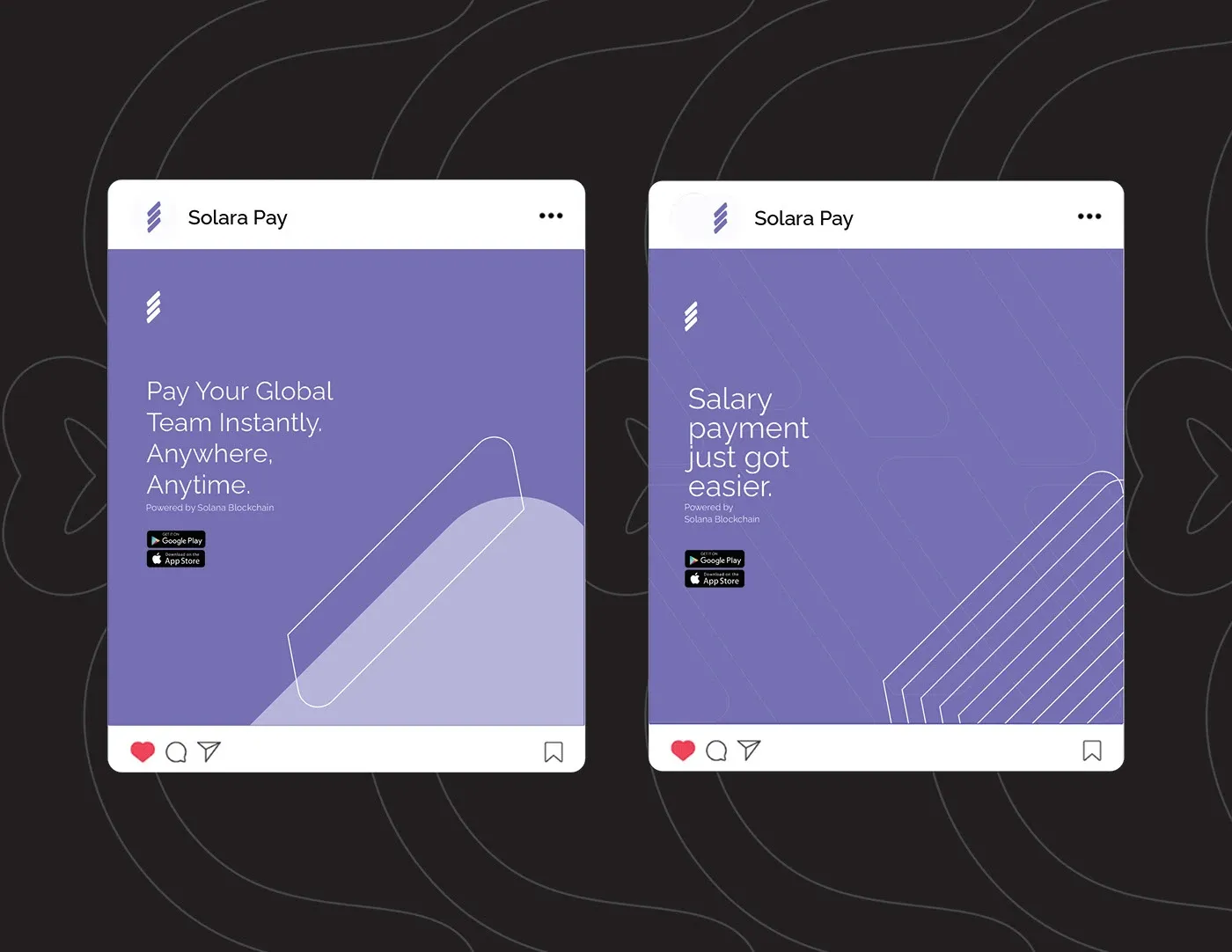
Pay your global team instantly, anywhere, anytime.
- Year
- 2024
- Services
- Brand identity, Logo design, Visual identity
- Client
- Solara Pay
About
Solara Pay is a financial technology company that leverages blockchain technology to revolutionize payroll disbursement processes. Utilizing the Solana blockchain, Solara Pay offers a fully automated and streamlined payroll system that ensures fast, accurate, and cost-effective salary payments to employees around the globe.
The problem
The challenge lies in visually and emotionally conveying its innovative, efficient, and secure payroll solution while standing out in a crowded market. The existing brand identity failed to convey the company values and expertise.
The solution
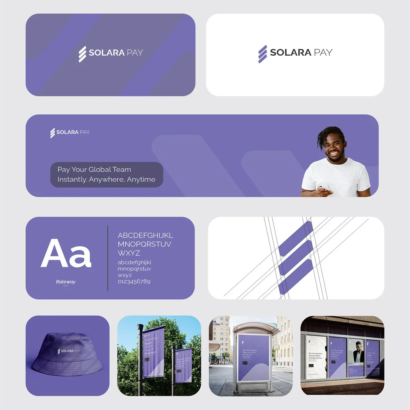
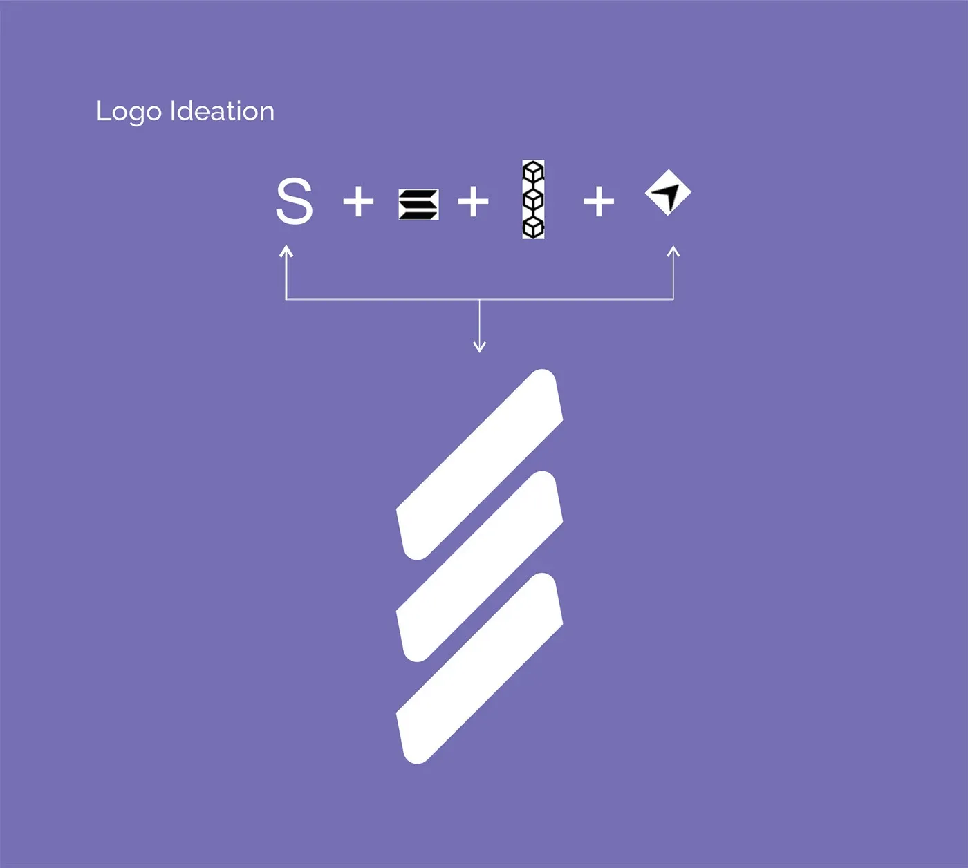
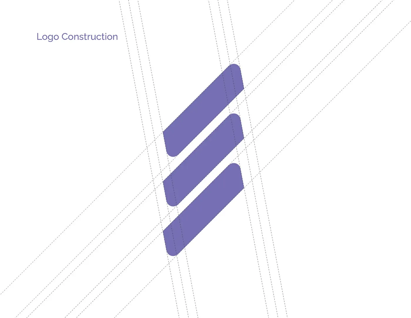
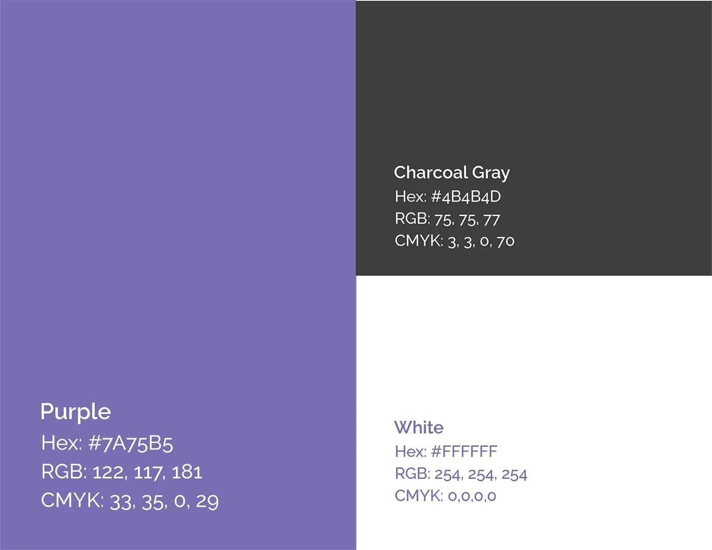
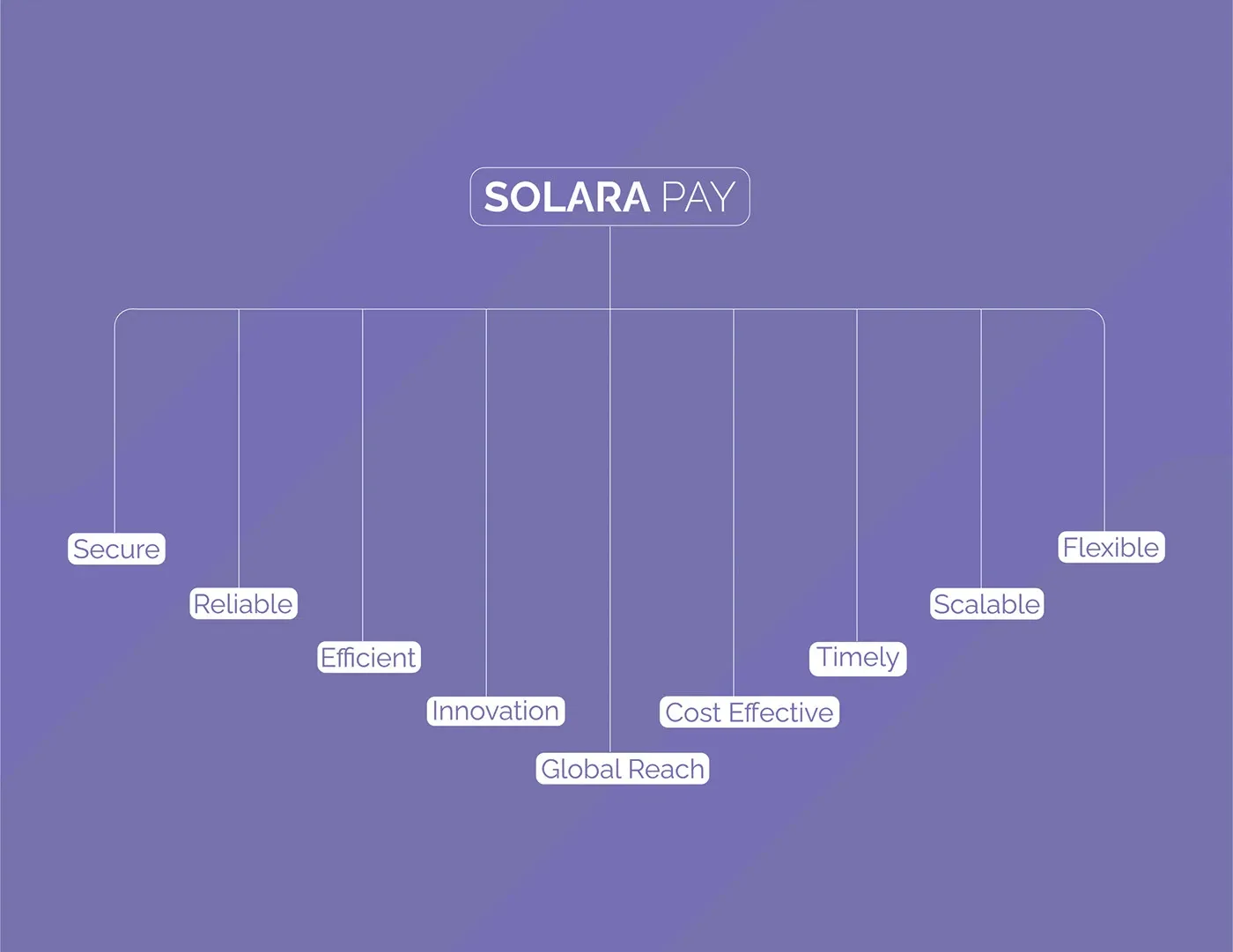
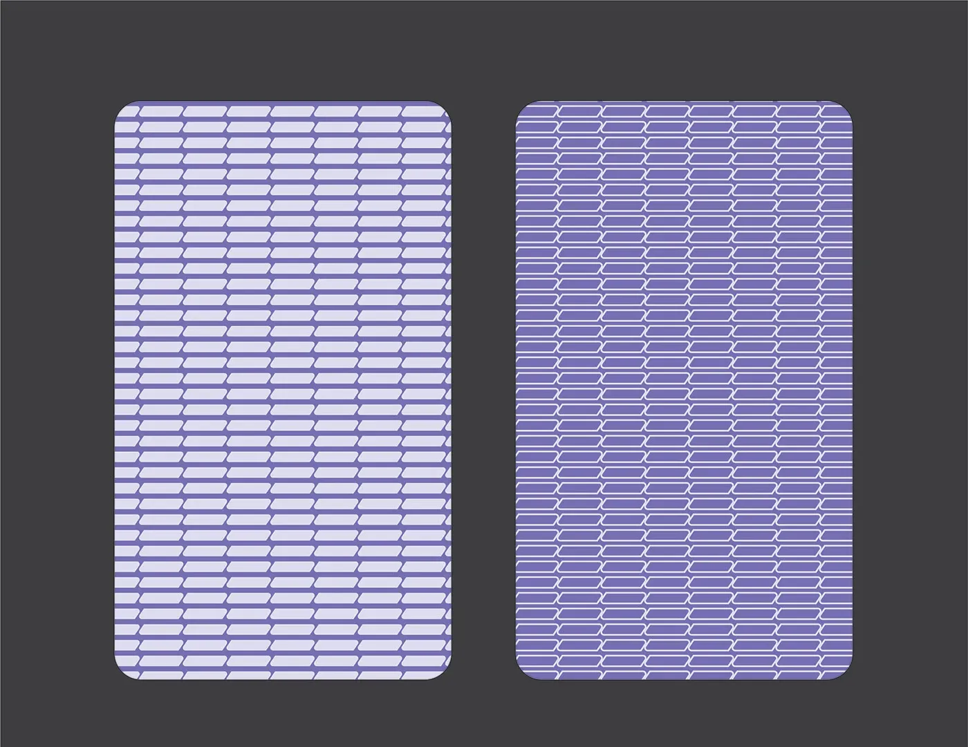
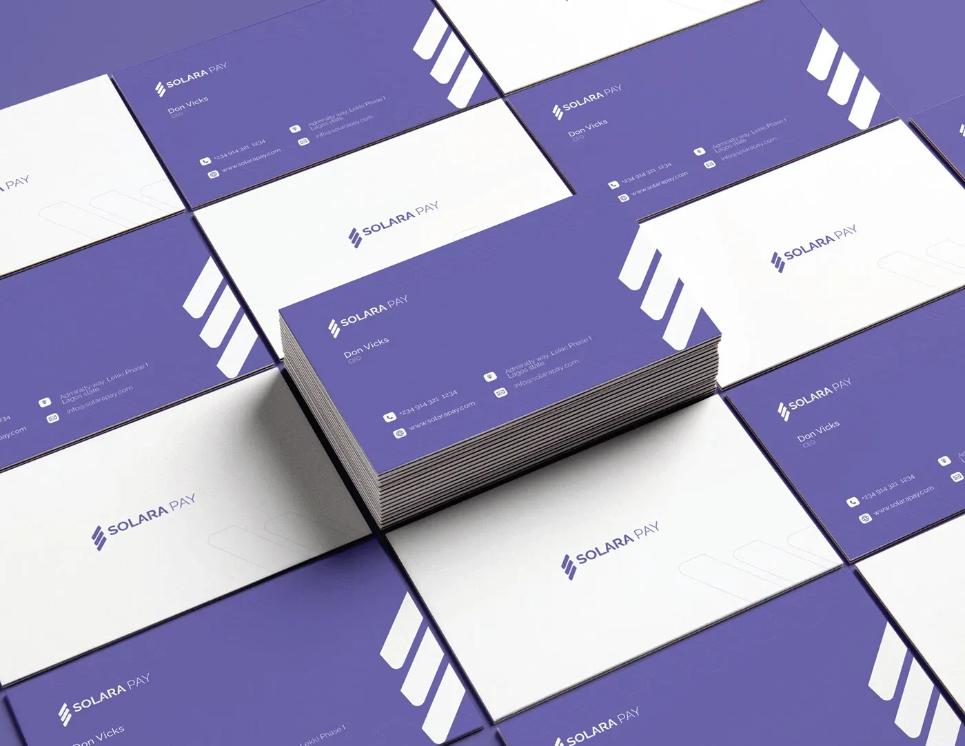
Solara Pay's brand identity is strategically designed to reflect its core attributes: innovation, efficiency, security, and global reach. The logo symbolizes blockchain technology, scalability, and seamless interconnectedness. A colour palette of purples communicates professionalism, trust, and a forward-thinking approach.
Colour and type
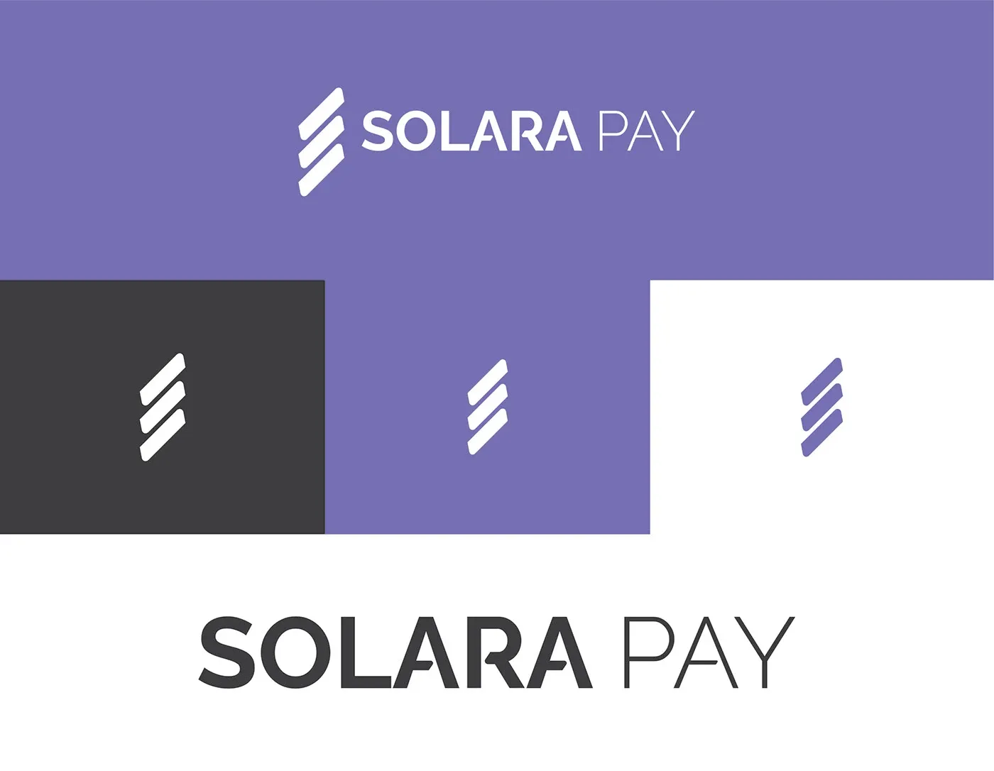
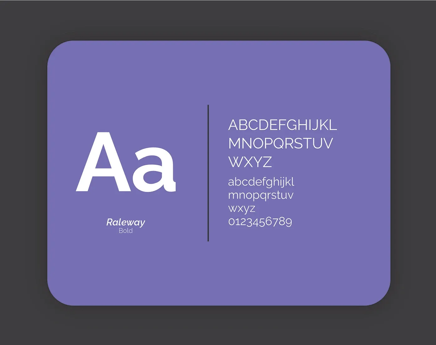
Purple carries the brand, charcoal grounds it, white gives the mark room. Raleway does the talking, plain enough for a payroll dashboard and wide enough to hold a billboard.
Salary payment just got easier.
Stationery and product
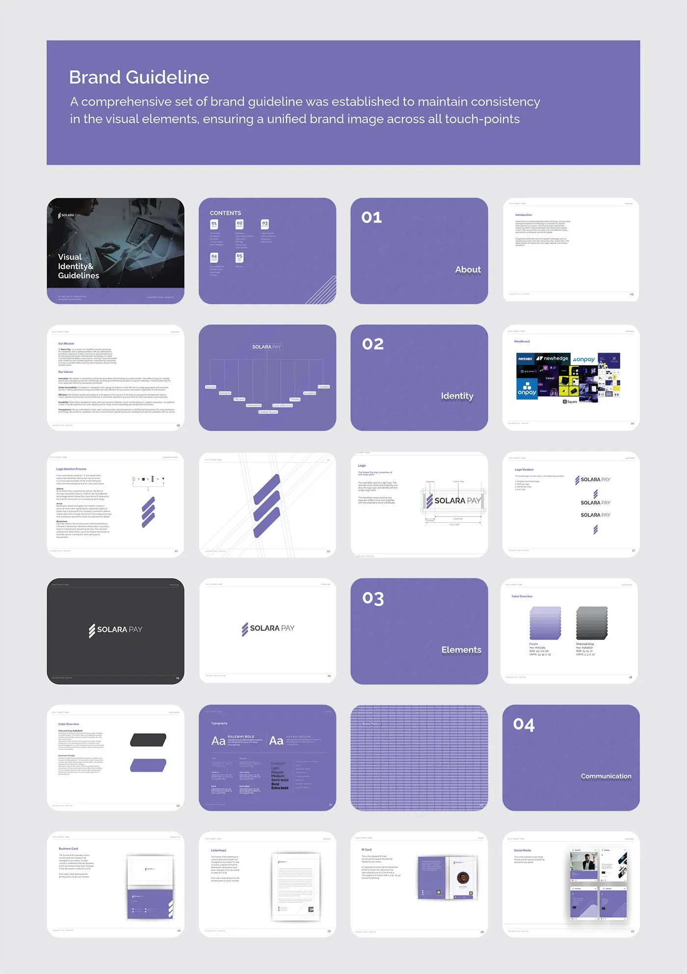
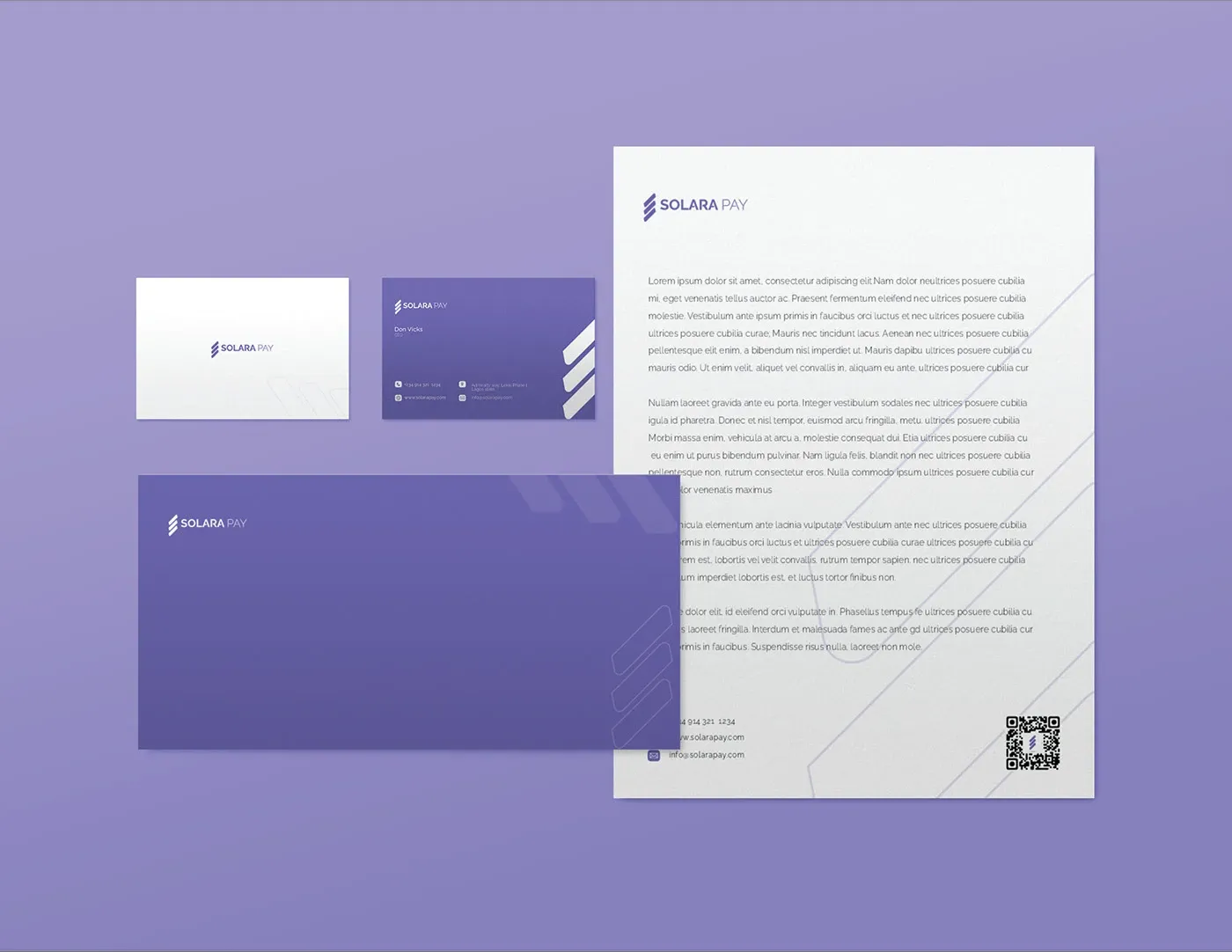
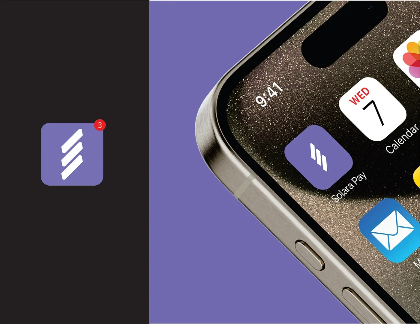
Payroll is a trust business, so the print had to feel like a bank and the app icon had to survive sitting next to everything else on a home screen.
The message
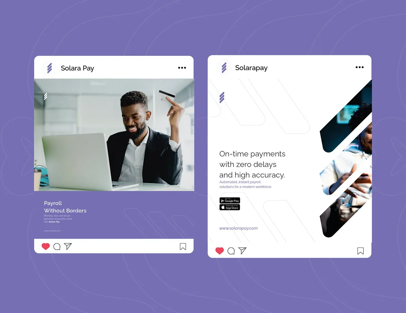
On-time payments with zero delays and high accuracy. The social system runs that promise across every format without restating it the same way twice.
Merchandise
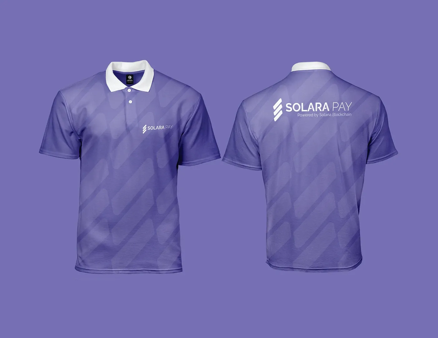
The mark had to work embroidered and small, on a cap and a keyring, not only at billboard scale.


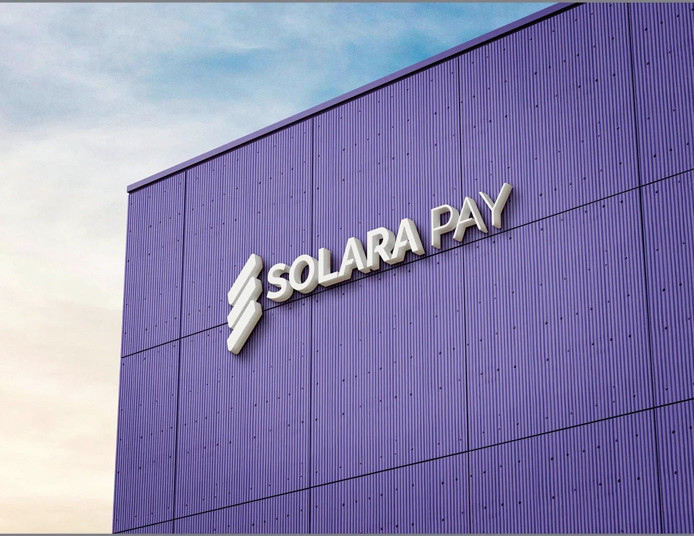
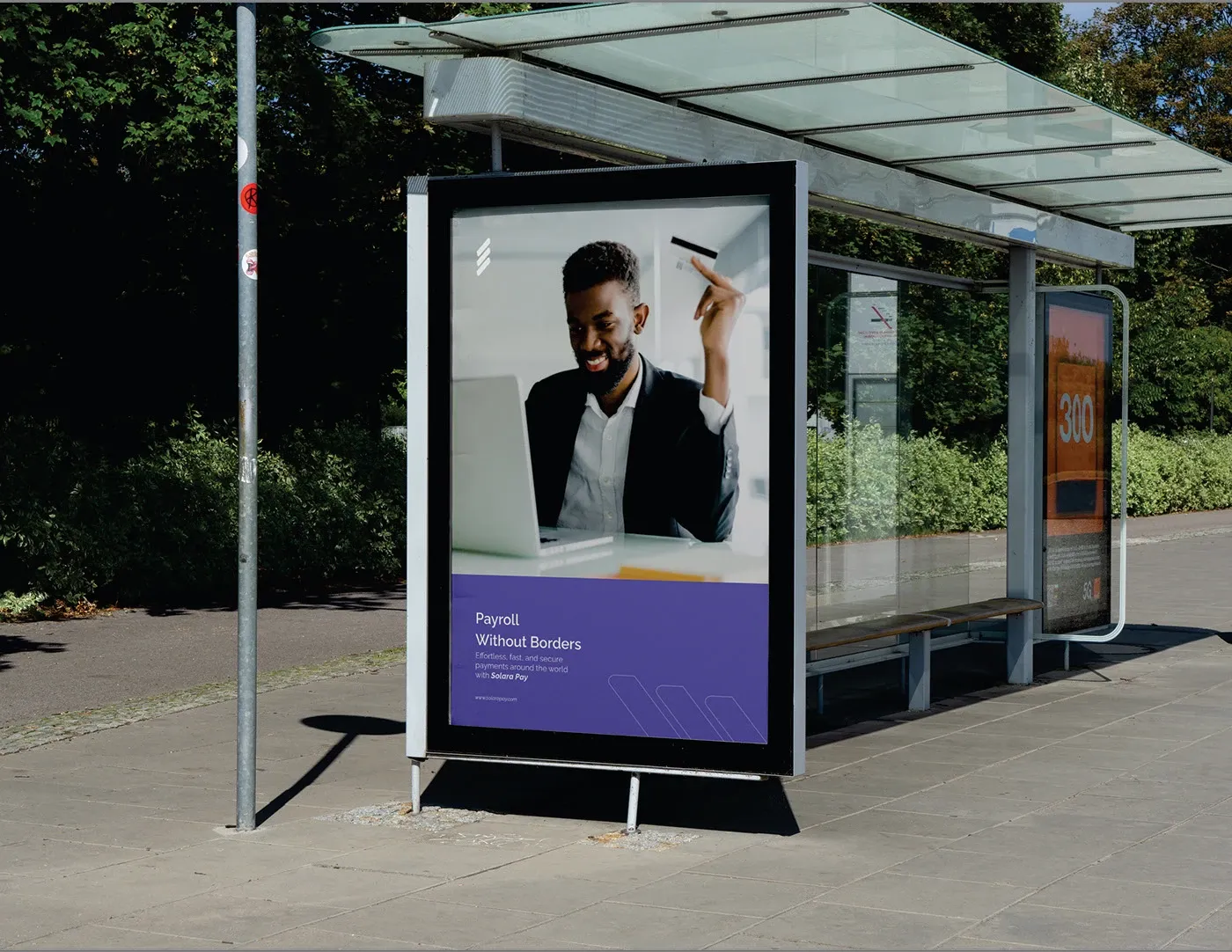
Out of home
Transforming payroll with the power of blockchain. The identity was built to hold at the size of a building and still read from a bus shelter.