Ọkín
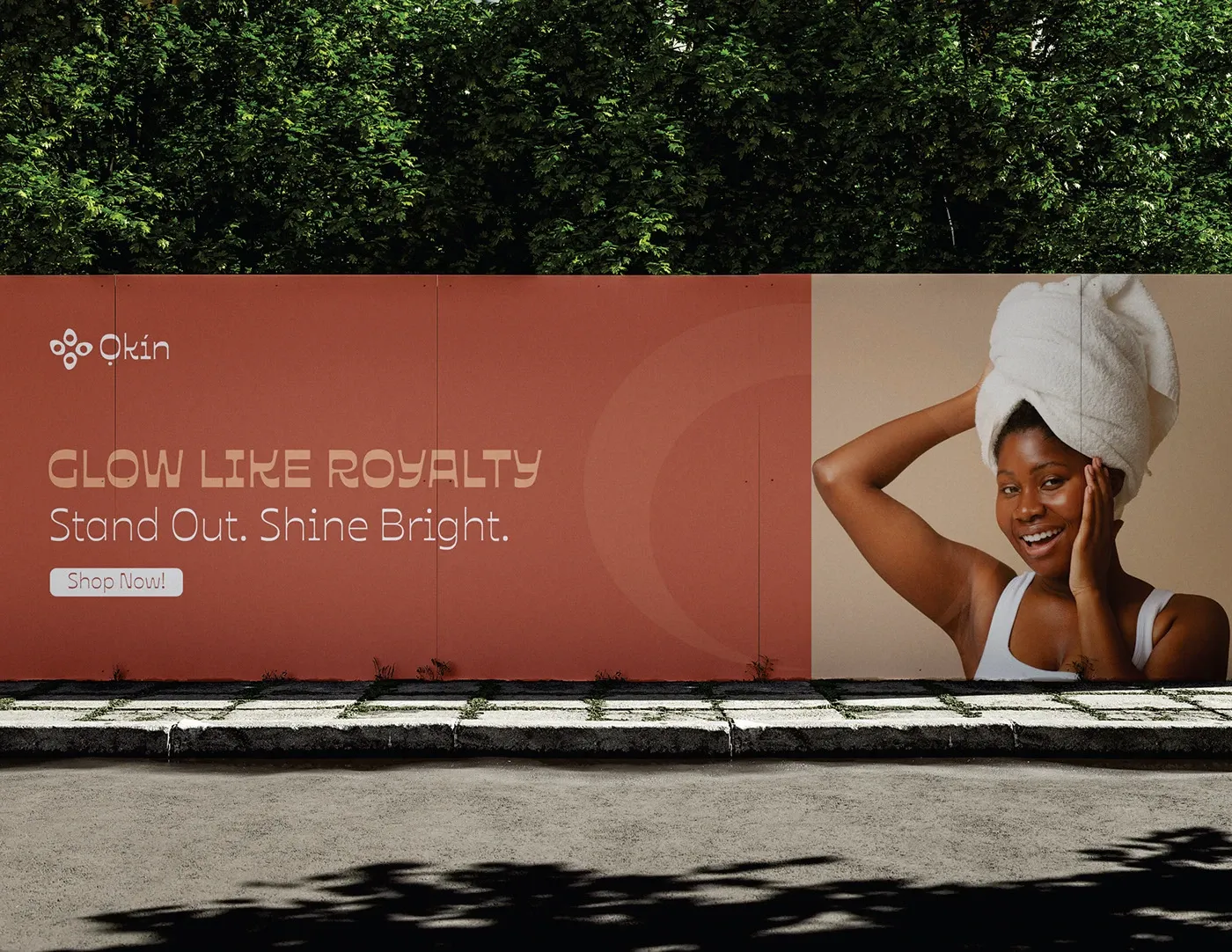
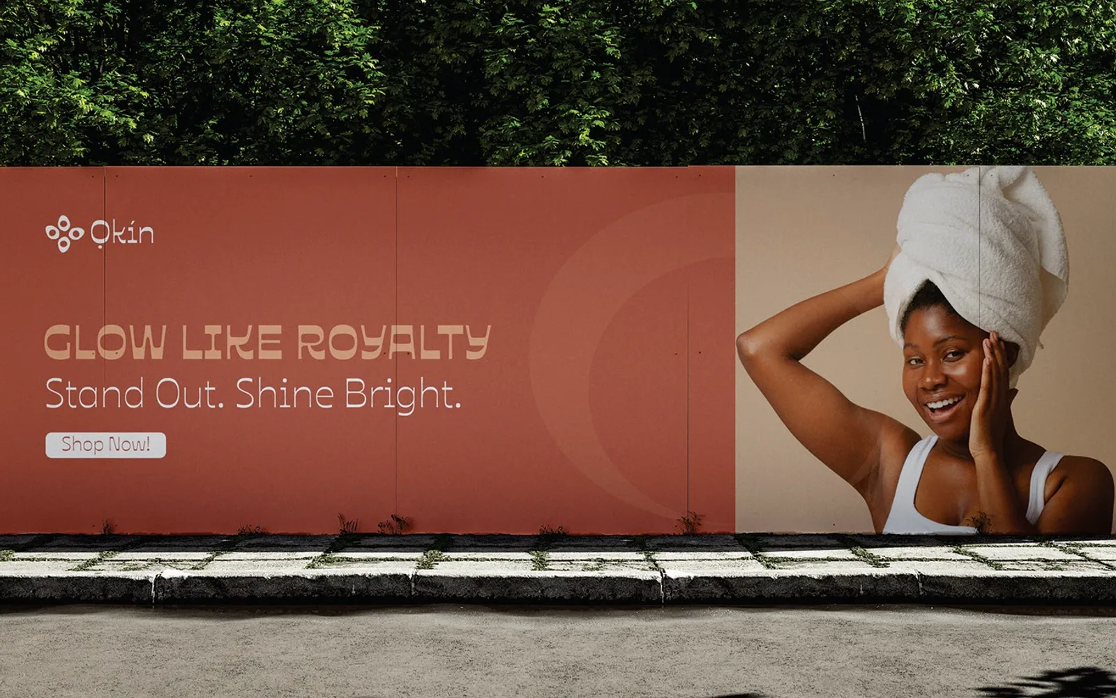
Glow like royalty. Stand out, shine bright.
- Year
- 2024
- Services
- Brand identity, Logo design, Visual identity
- Client
- Ọkín
Rationale
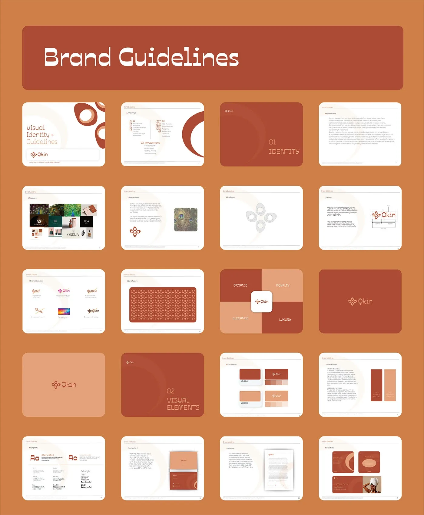
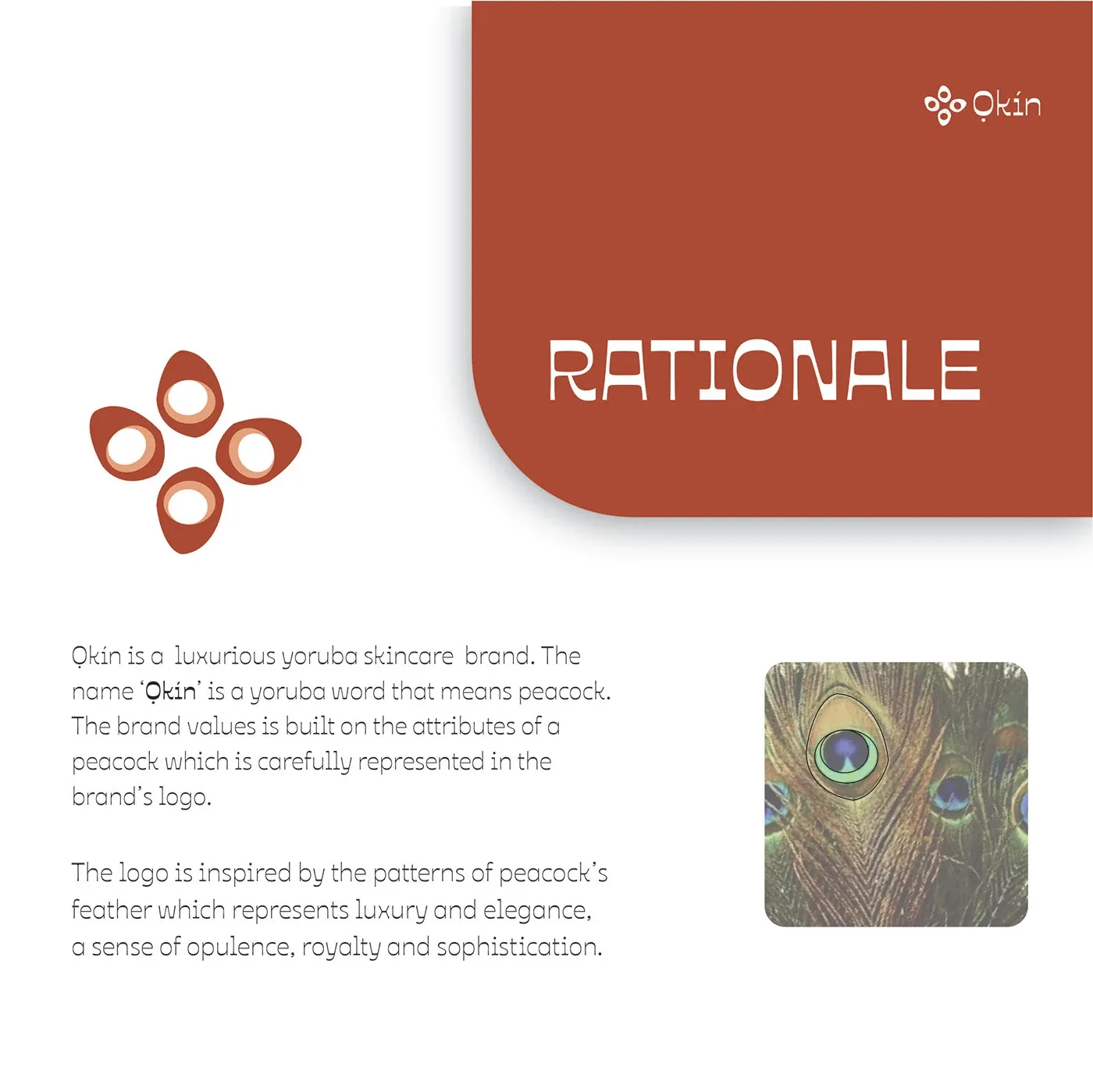
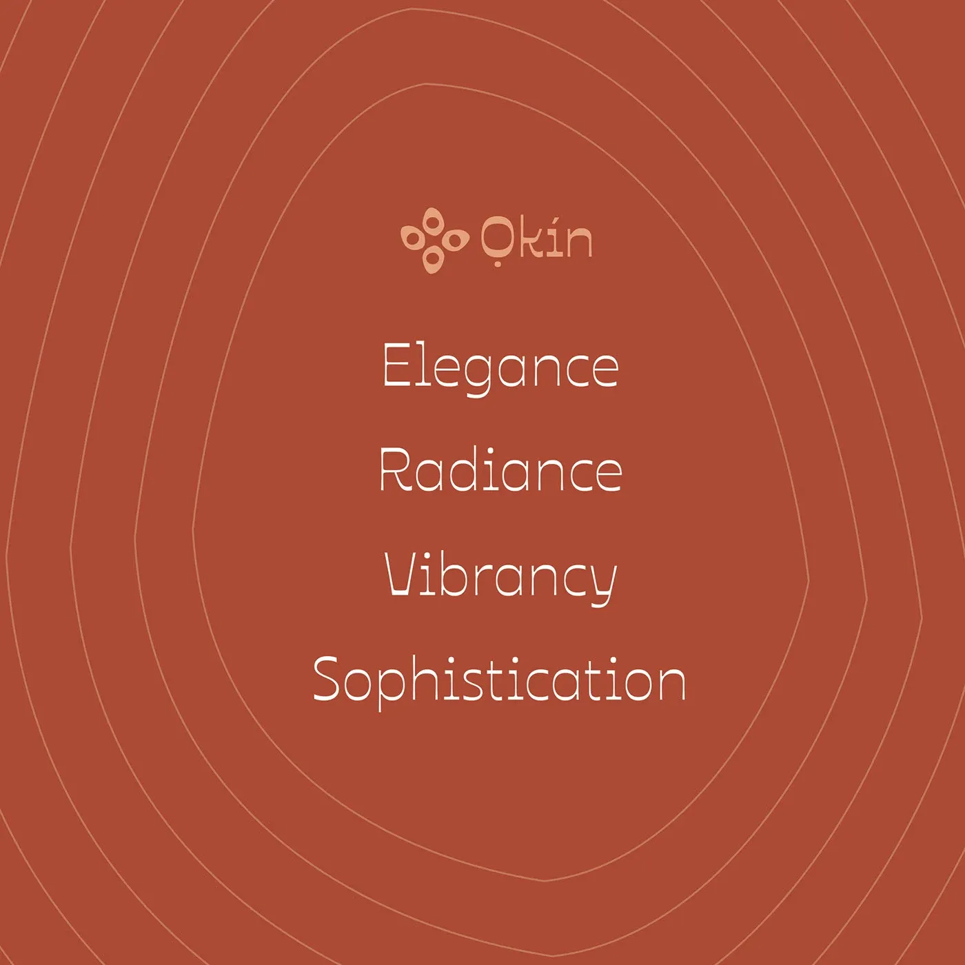
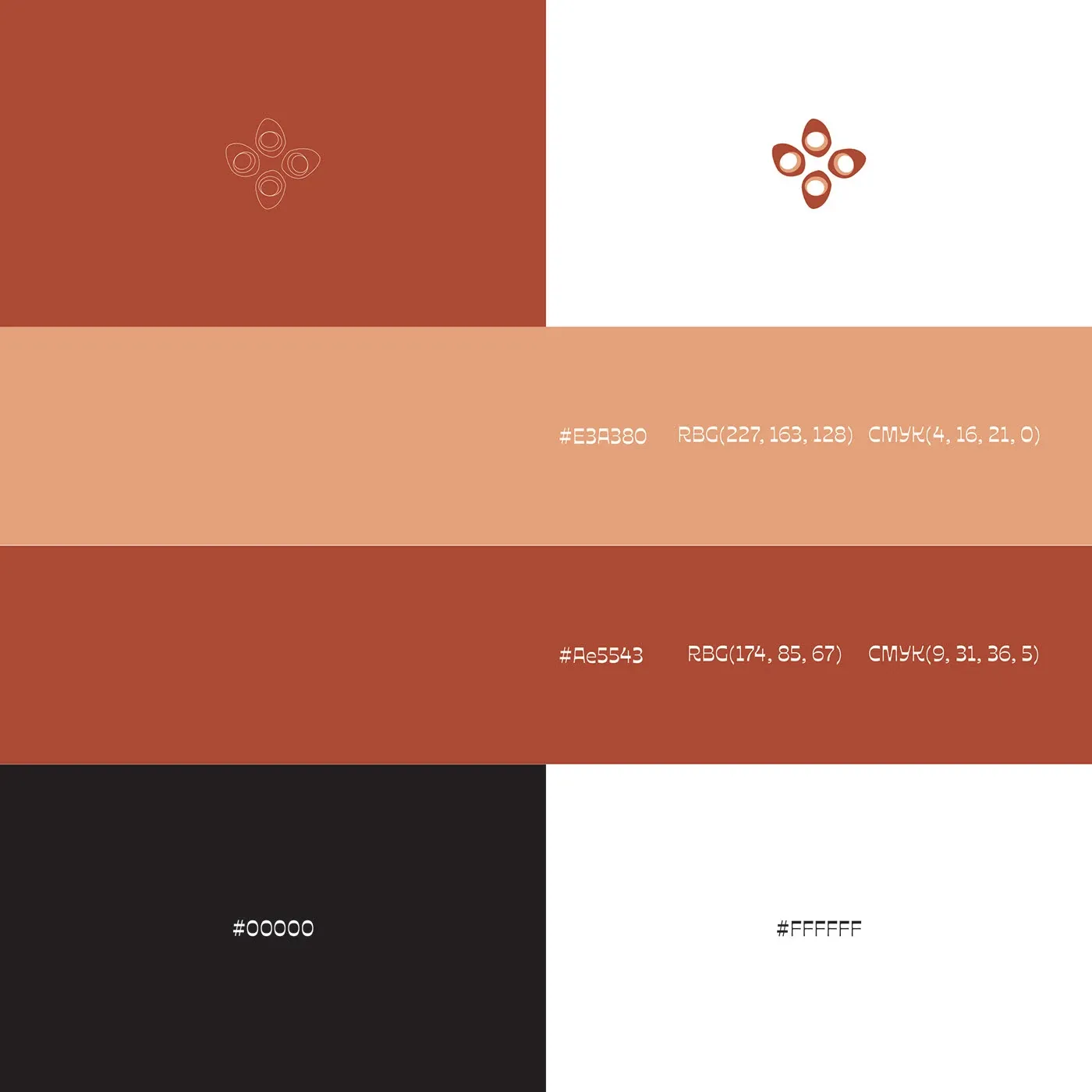
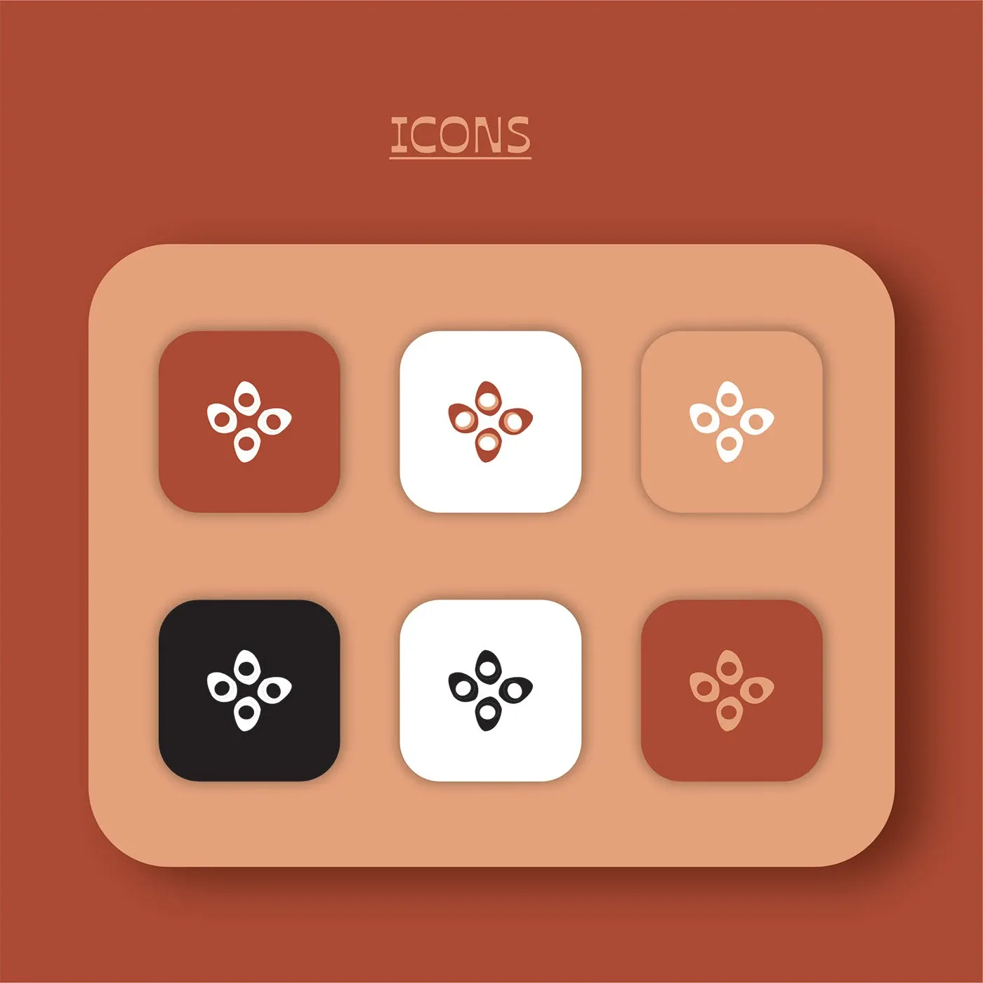
Ọkin is a luxurious yoruba skincare brand. The name Ọkin is a yoruba word that means peacock. The brand values is built on the attributes of a peacock which is carefully represented in the brand logo. The logo is inspired by the patterns of a peacock feather which represents luxury and elegance, a sense of opulence, royalty and sophistication.
Colour and type
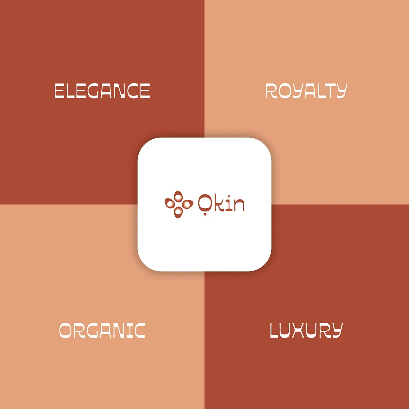
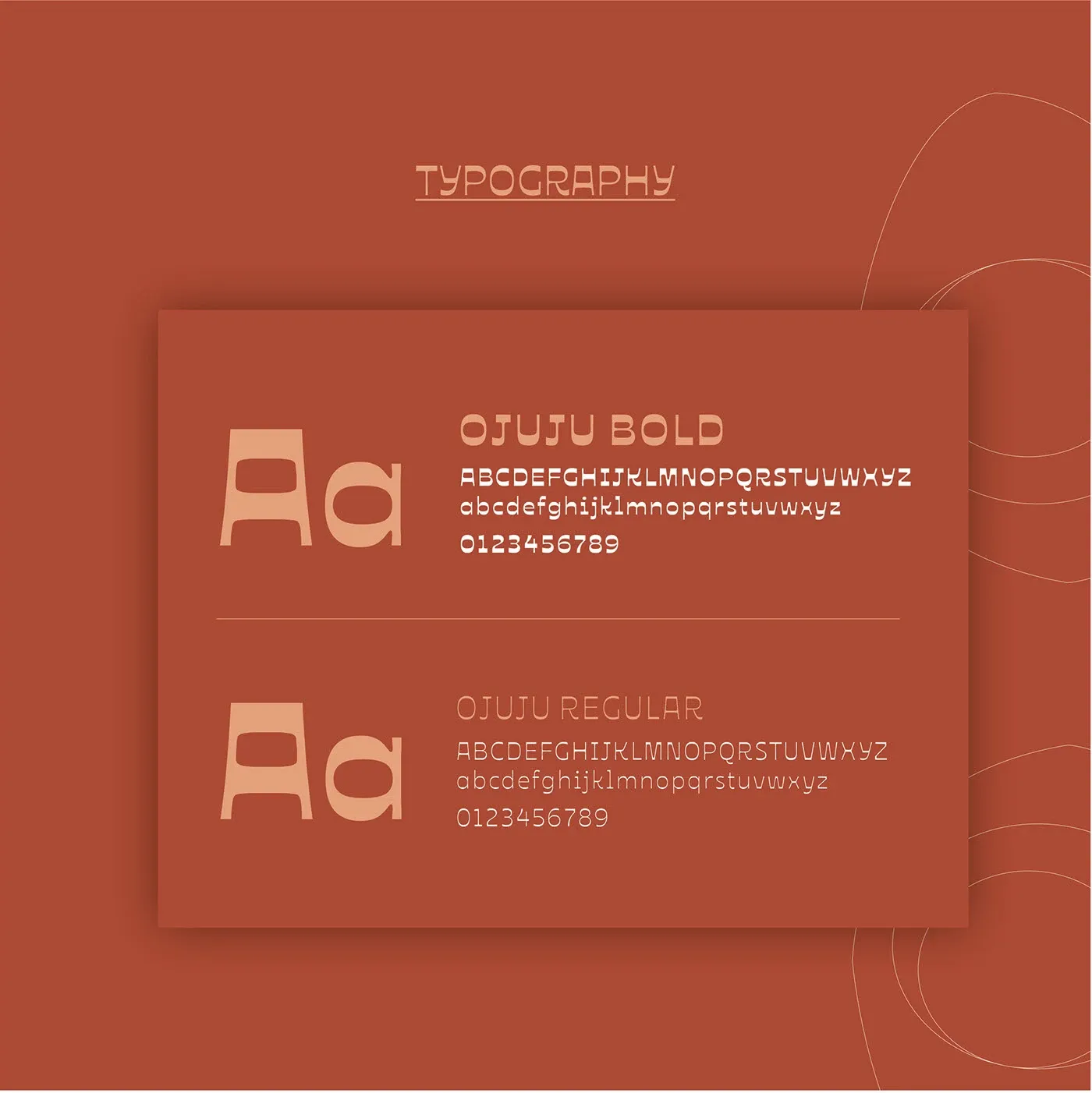
A terracotta and clay palette, warm rather than clinical, set against Ojuju in bold and regular. The type is rounded enough to read as skincare and geometric enough to hold the mark.
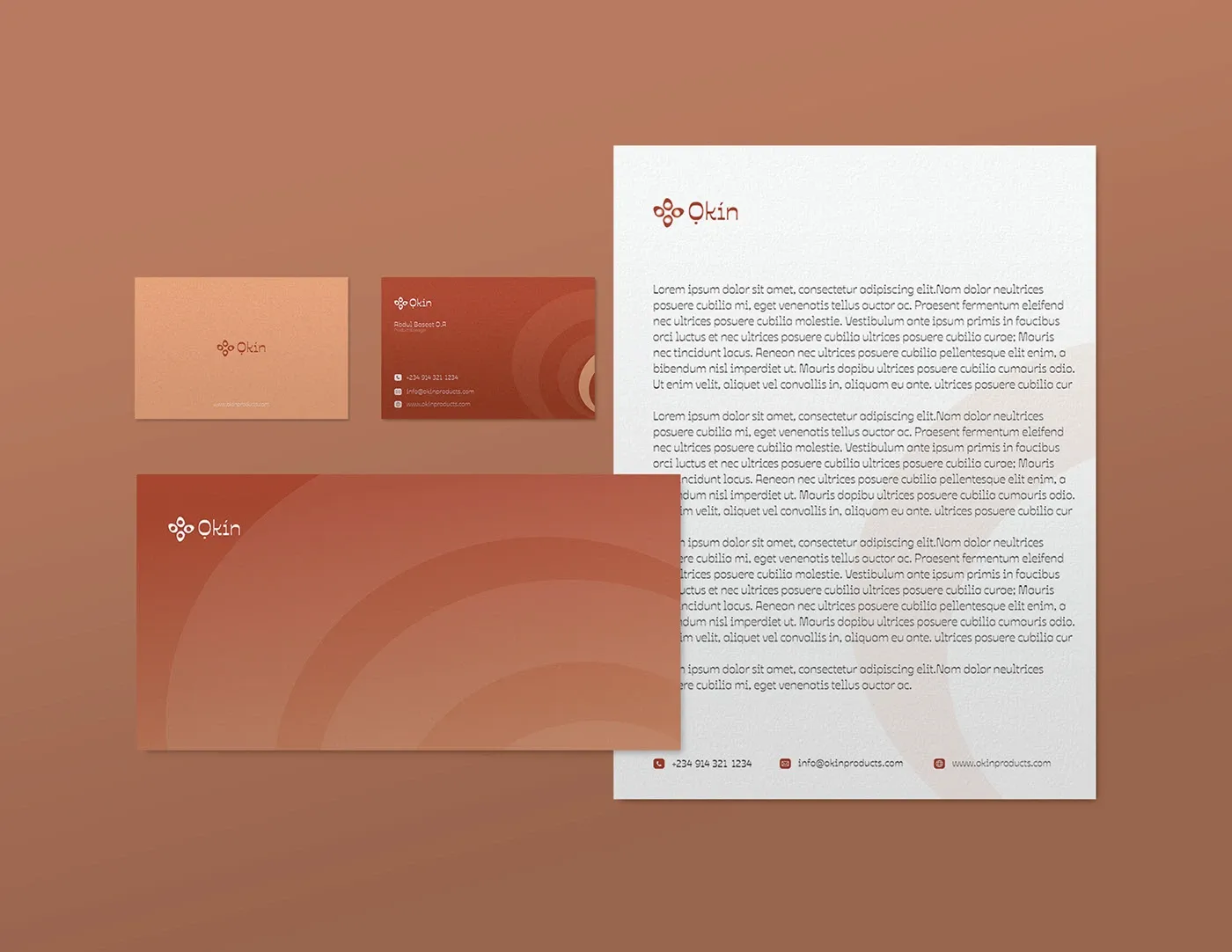
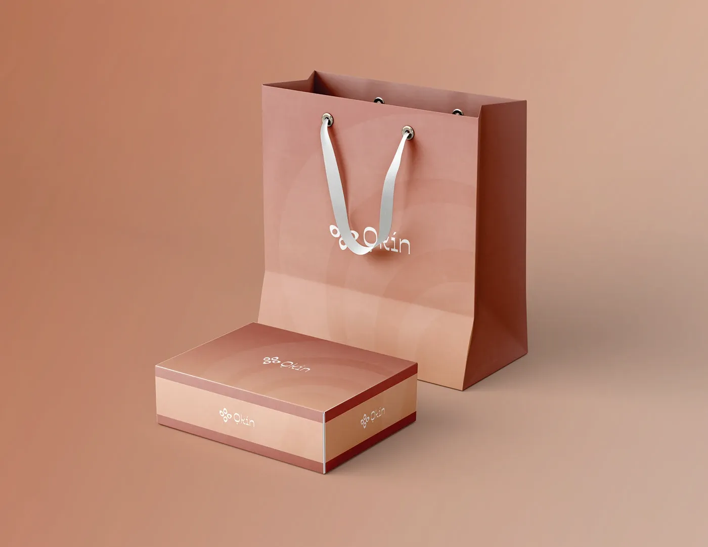
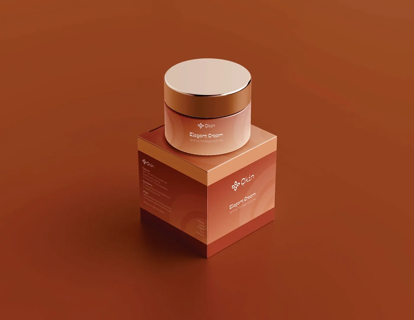
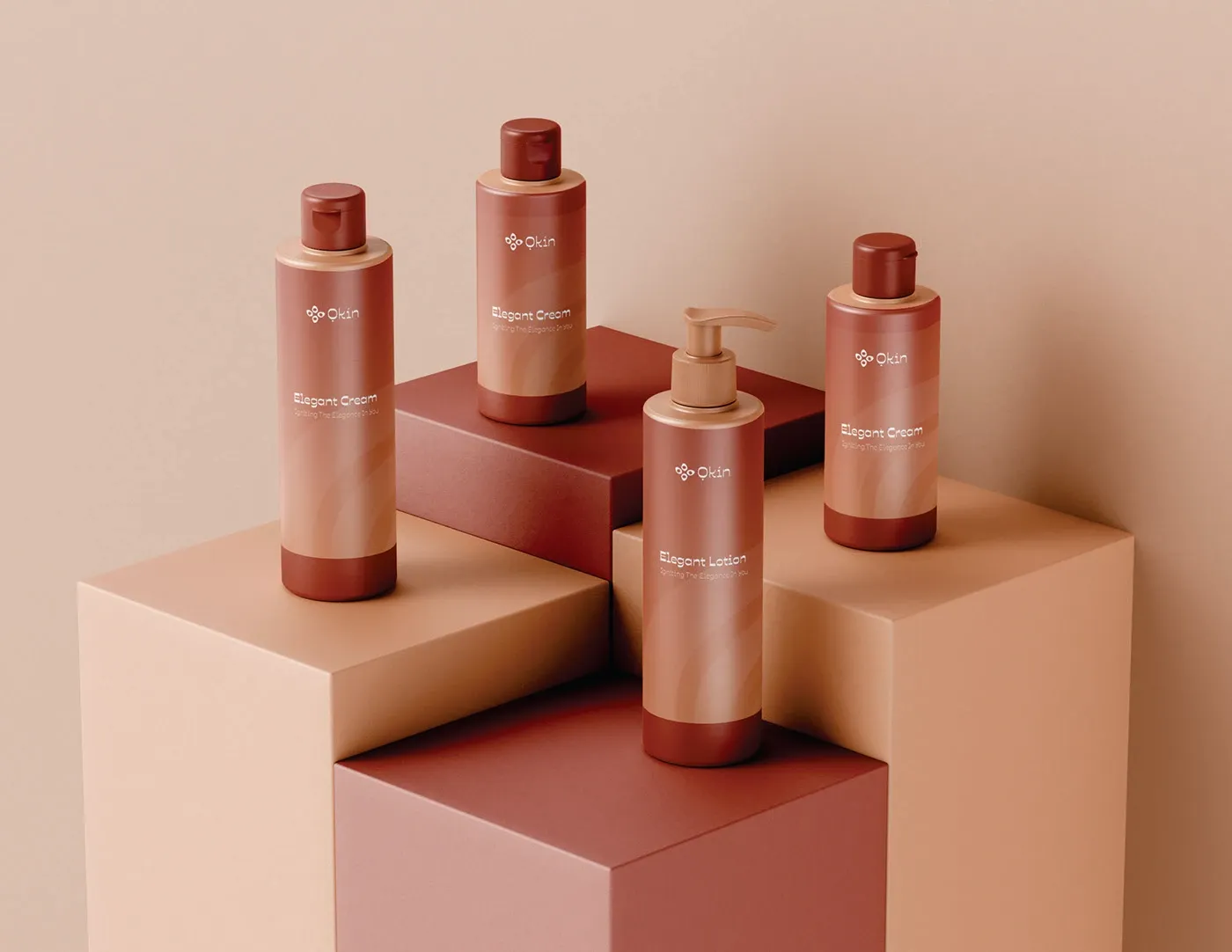
Packaging and stationery
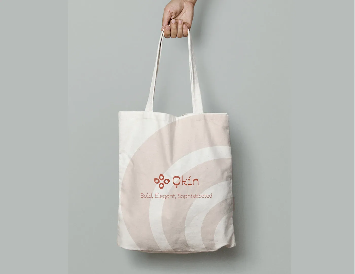
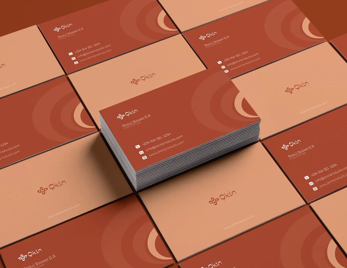
Skincare is bought with the eyes before the skin. The packaging carries the mark quietly and lets the palette do the work of signalling premium.
Glow like royalty
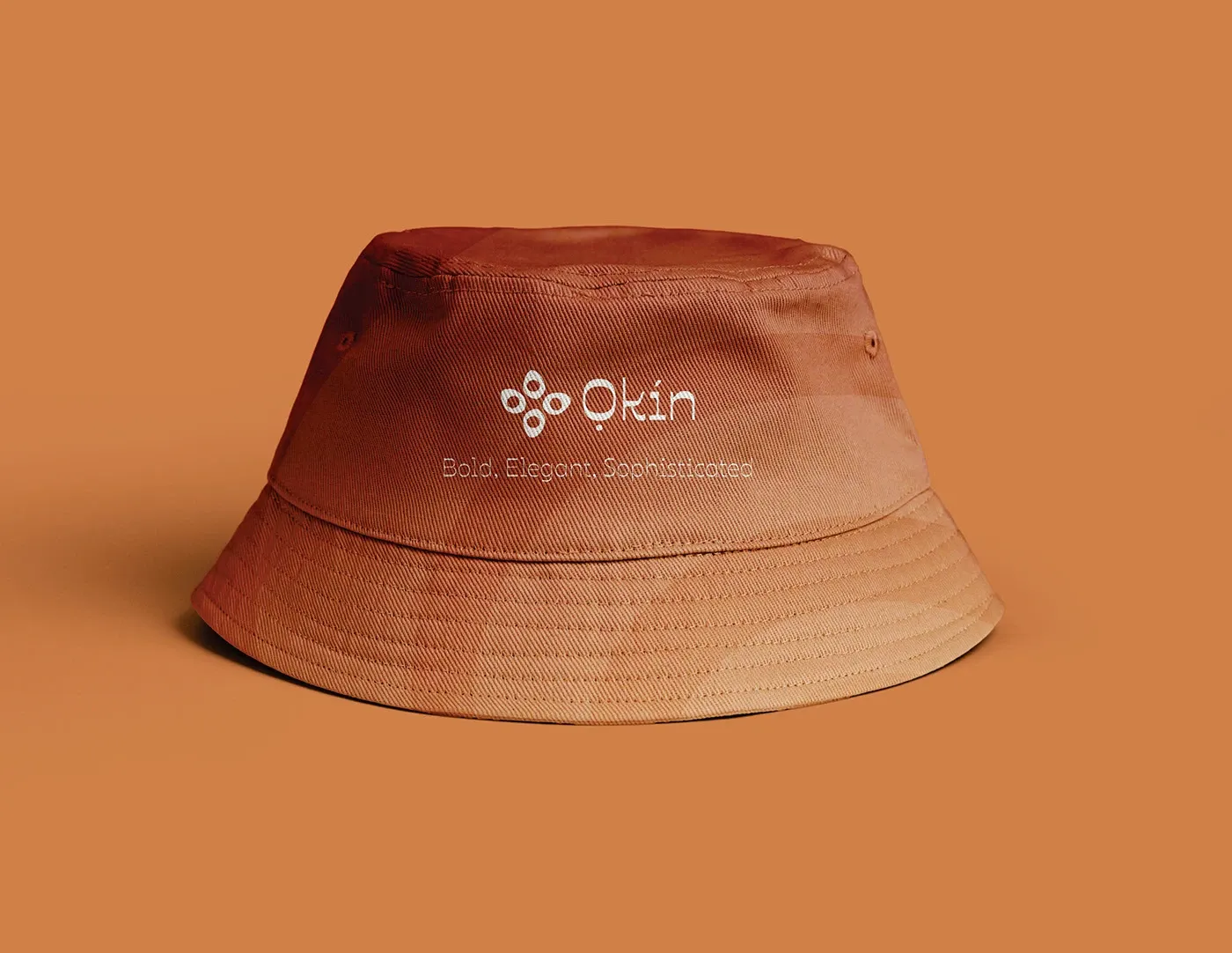
The line ran everywhere the brand went, from the bucket hat to the billboard. Stand out, shine bright.