NACOS Hackathon
The Mind Behind the Machine. An identity built to outlast its own event.
- Year
- 2026
- Services
- Brand identity, Event design, Social media
- Client
- NACOS, Crescent University Abeokuta chapter
The problem
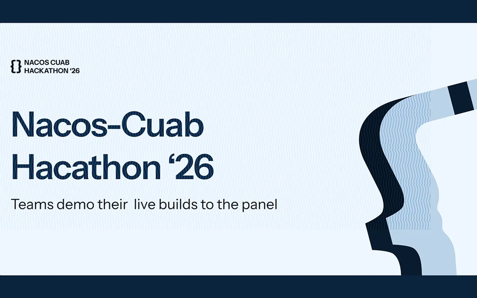
The department already had a logo and a recognisable colour, but that alone was not enough to support a project of this scale. As planning progressed, the number of deliverables continued to grow: social media campaigns, merchandise, print materials, event spaces, documentation, digital experiences, and future initiatives all needed to feel like they belonged to the same system. Designing for the hackathon meant designing beyond the hackathon.
The idea
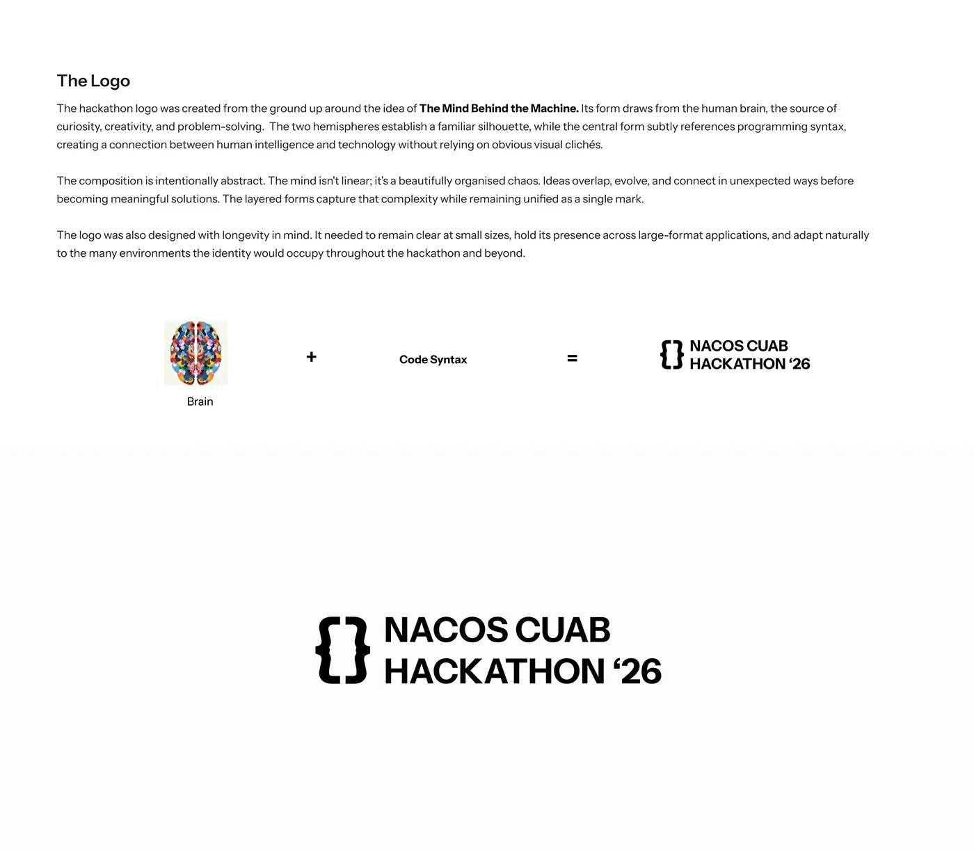
Artificial Intelligence may shape the future, but every breakthrough begins with human thought. That idea became the foundation of the identity. The theme, The Mind Behind the Machine, places the human mind at the centre of innovation. Rather than presenting AI as the hero, the identity acknowledges it as a tool shaped by human creativity, curiosity, and problem-solving. Every solution starts as an idea before it becomes code.
Innovation is not defined by technology alone. It begins with the people behind it.
The system
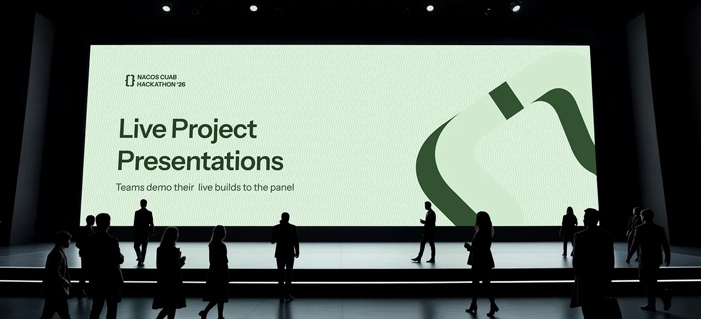
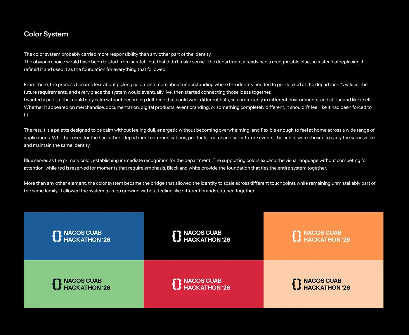
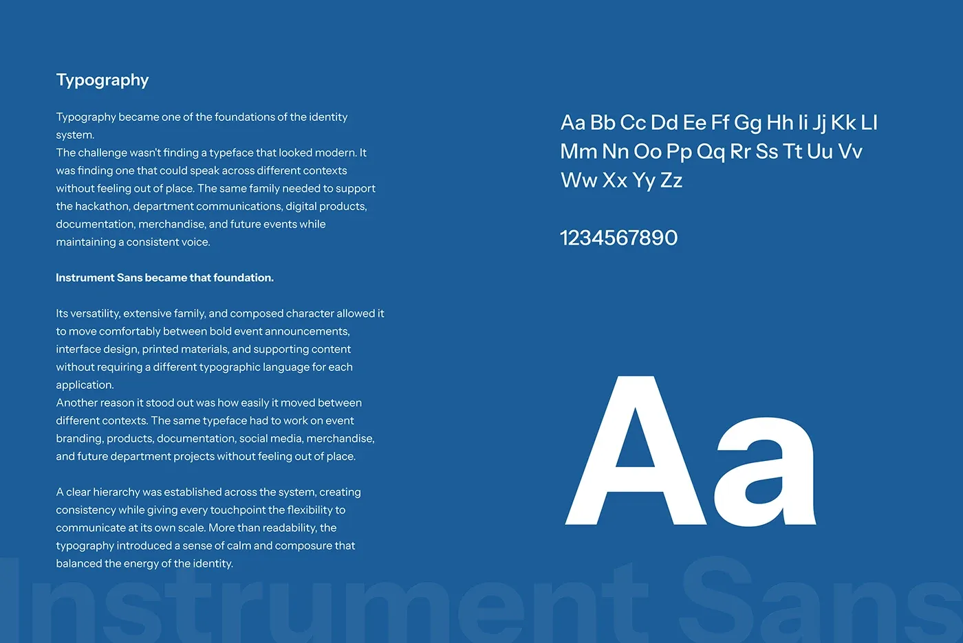
The way of thinking influenced more than the messaging. It became the principle behind the visual language itself, guiding how the logo, supporting graphics, and identity system were developed.

The tickets
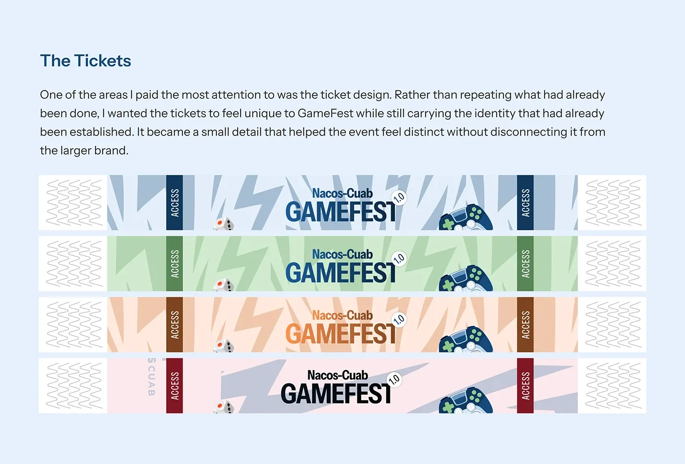
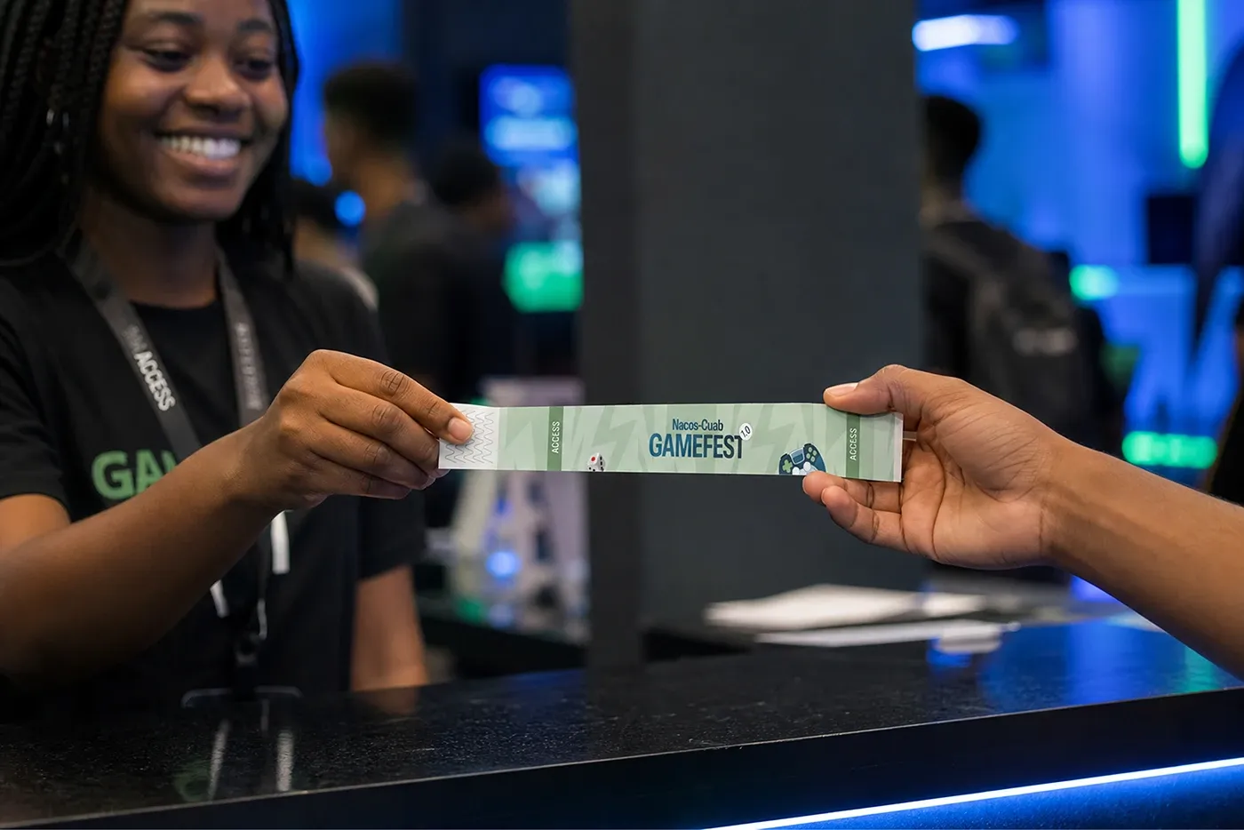
One of the areas I paid the most attention to was the ticket design. Rather than repeating what had already been done, I wanted the tickets to feel unique to GameFest while still carrying the identity that had already been established. It became a small detail that helped the event feel distinct without disconnecting it from the larger brand.
Merchandise and documents
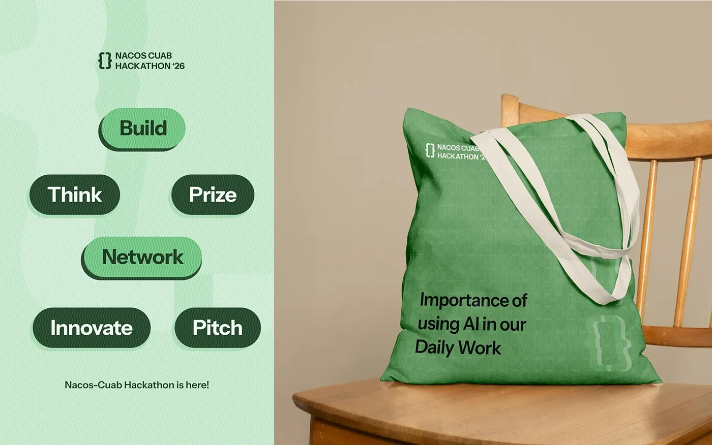
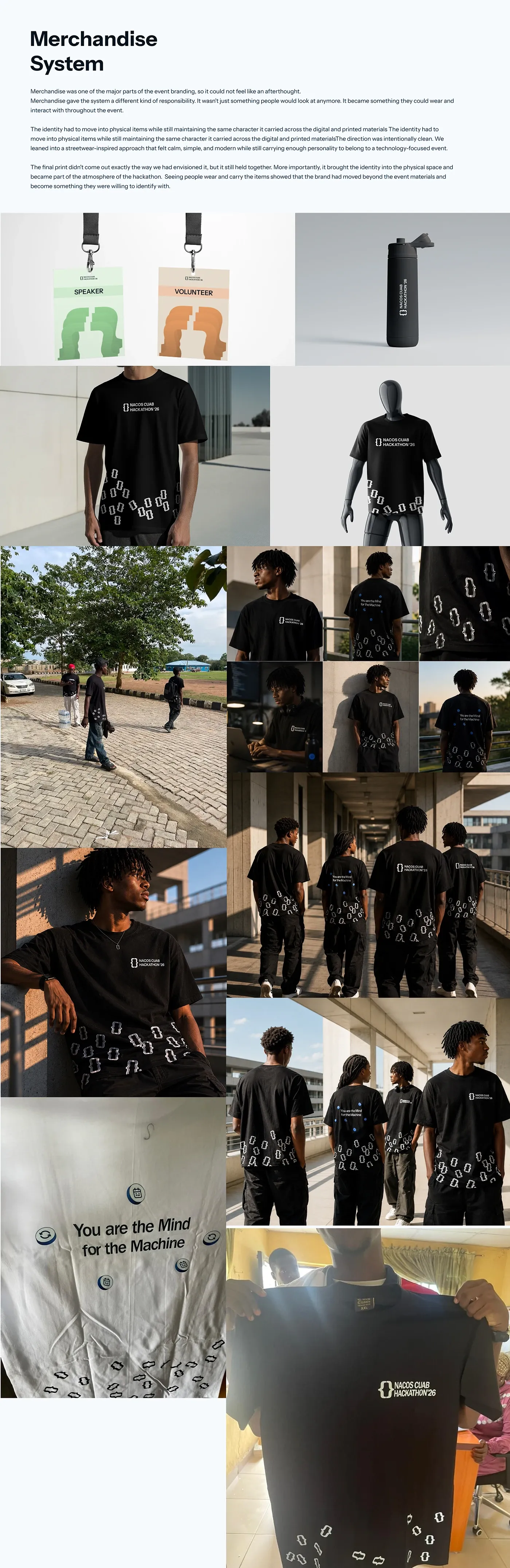
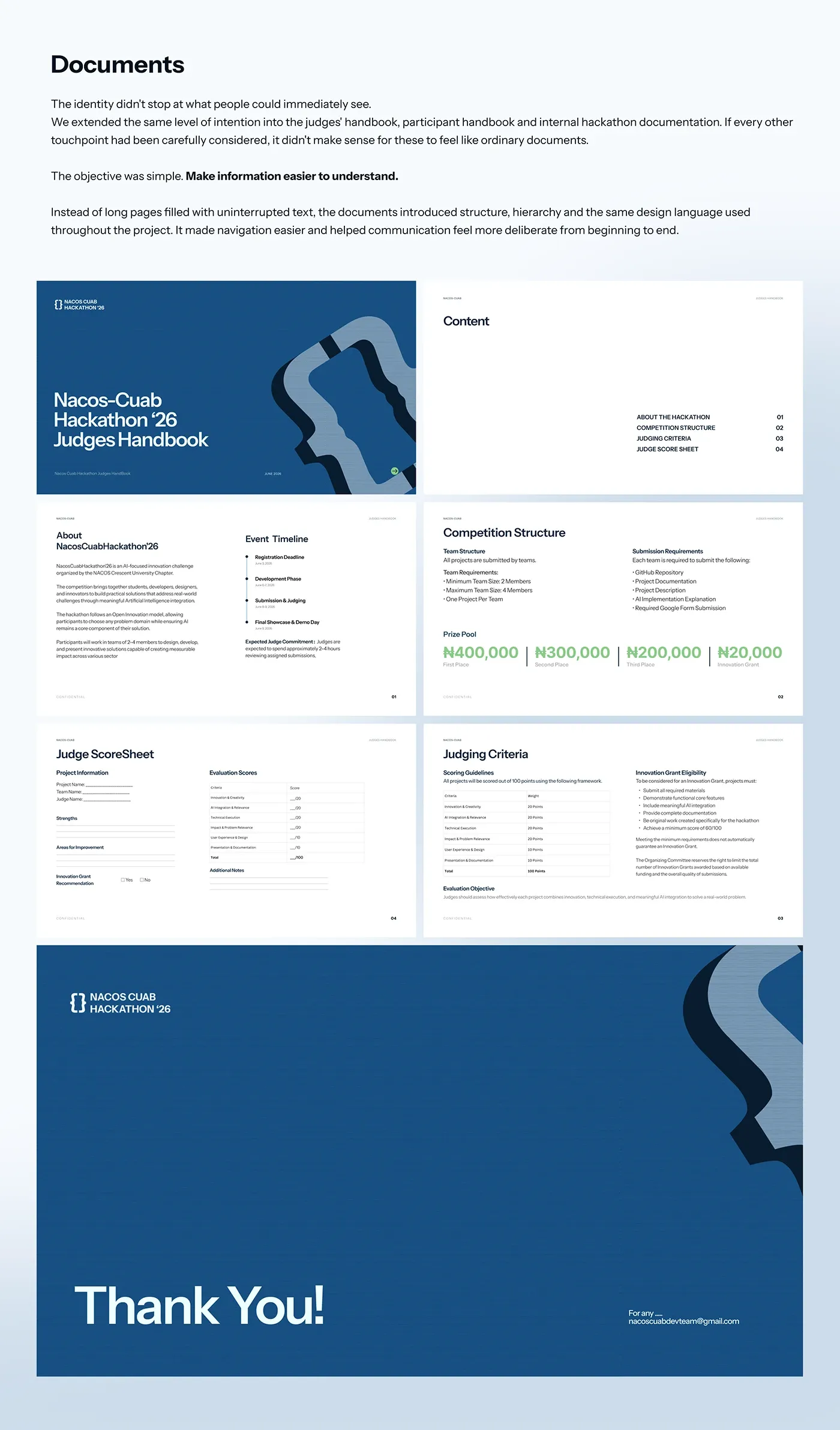
The system had to survive contact with real objects. Totes, medals, lanyards and a judges handbook all pull from the same set of rules.
GameFest, and the sports day
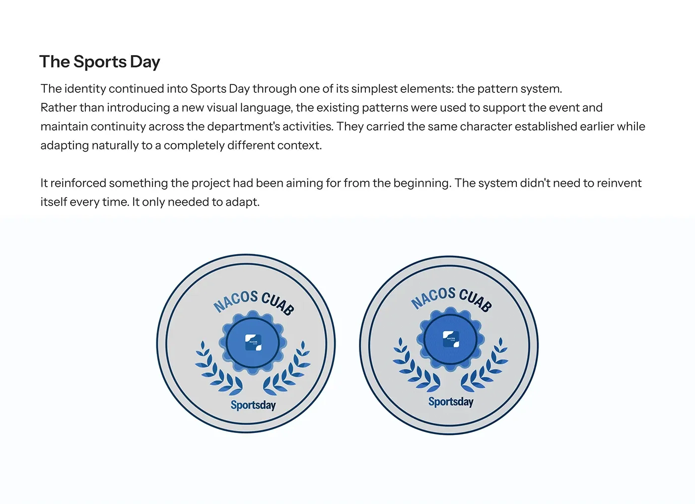
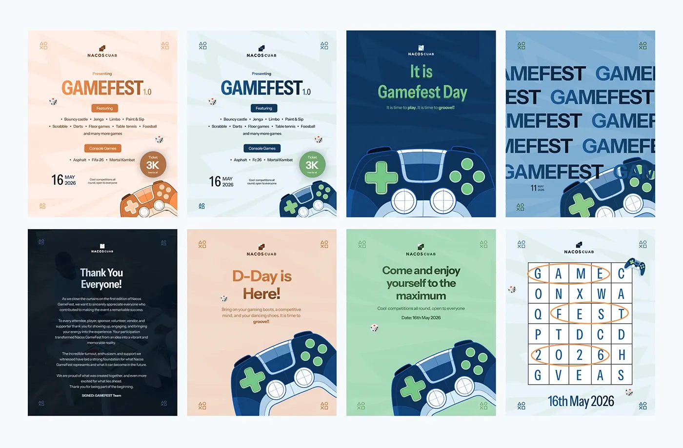
GameFest was the first major extension of the identity outside the hackathon, and it worked. The system did not need to reinvent itself every time. It only needed to adapt.